Customize your Color
How to choose the right colors for your site
 Color ought to be at the forefront of your designer’s mind, and as the client, you need to be prepared to provide samples of your corporate colors, logos or branding. If a logo is yet to be designed and is included as part of your web development project, then discuss with your designer the colors you intend to use.
Carefully consider the effect your color choices will have on the readability of the webpage and also the subconscious impact color makes on your site’s visitors. If you thought choosing colors was all about aesthetics, then remain a moment longer because this mini color tutorial was written just for you! Let’s call it: Color Psychology and Browser Limitations 101.
Color Psychology: It’s not just for New Age Hippies
Color combinations produce legitimate emotional and behavioral effects in those that view them, and it is to your advantage to learn which colors will invigorate, invoke trust, or make your visitors see dollar signs. Because each culture and region may associates a different significance with certain colors, I will focus on general color influences in North America. The following are a few of the colors that are the most popular and powerful in the corporate world:
- Red: stimulates adrenaline and appetite, invokes passion (great for websites related to cooking, recipes, restaurants, cooking tools, sports, and dating)
- Yellow: highly visible, runs the risk of over-stimulating (great for borders around banner advertisements)
- Green: fresh and clean, associated with money, associated with technology and innovation (an obvious choice for banks, tech solutions companies, environmental groups)
- Blue: invokes trust, intelligence, associated with natural elements such as the sea and sky (ideal for websites related to providing accurate information, legal services, environmental groups, medical services, historical data)
- Purple: wealth, royal or noble (great for customized, rare, and high-end products and services sites)
- Orange: invokes energy and inspiration, forward-thinking, corporate (great for sites providing clients with exciting alternative solutions to common services, such as banking, cell phones, and technology)
- Black: invokes an air of elegance or feelings of oppression (sharp and effective when used sparingly, such as sites for sports cars or photography)
- White: clean, pure (ideal as a default background color due to sharp contrast with typical black lettering and accent colors)
My advice to the client and designer is not to be afraid to use colors, but not to over-do it, either. Incorporate colors into your page design so that the reader’s eye is drawn to the most valuable information, but use intense or eye-catching colors sparingly. It is critical that you balance color with an appropriate amount of white space in order to avoid overwhelming or exhausting the viewer.
In order to make the greatest impact on your webpage, invest time and refer to a basic color wheel to determine which colors are most complimentary of your principal color choice. Elements from the yellow, red and blue spectrums of the color wheel are scientifically proven to be more aesthetically pleasing, which goes a long way toward a successful design. However, it could pay to experiment and come up with something unique! Your goal is to have a website that stands out with a recognizable branding.
Tech-y Color: Is your Browser color-blind?
Your browser’s colors
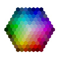
 While you ponder which colors will be the most effective for your website, you must also consider the limitations that crop up when viewing colors within a web browser. Browsers are capable of showing 256 browser-safe colors, but unfortunately, not all web browsers share the same browser-safe color pallet. Consistently, the browsers share approximately 216 of the same colors, so it is wise to design your site’s main features within those limits.
If you choose to go outside of the browser-safe 216 pallet, the viewer’s browser is forced to render dots of color (called dithering) that are most closely related to the color chosen, in order to create an approximate match. While this will be okay in some displays, other displays will display an image distorted by dots.
There is a bright side, however, because today most modern displays are capable of rendering more than 16 million colors. However that may be, it is the exception rather than the rule, as much of the world is surfing the internet with equipment that is in need of updating.My professional advice is to always keep the needs of the viewer in mind and to always stick to the browser-safe 216 spectrum for all major site design elements.
The color scheme options are widely varied, but don’t become overwhelmed. Keep it simple. Keep it clean. Here are a few of your options:
- Monochromatic: this color scheme has one base color and any number of tints (lightens the base color) and shades (darkens the base color) of that color
- Analogous: this color scheme is made up of colors that are adjacent to one another on the color wheel
- Complimentary: this color scheme is made up of colors that are opposite to one another on the color wheel
Here’s a quick tip to achieve the all-important balance of using color in site design: Use light colors for the background and all large design elements because light colors will not overshadow your content. Balanced with light colors, warm colors create a visual emphasis and make particular features stand out.
Make a statement and stand out from the competition. Get the guidance you need to make the right color and design choices for your site today.
